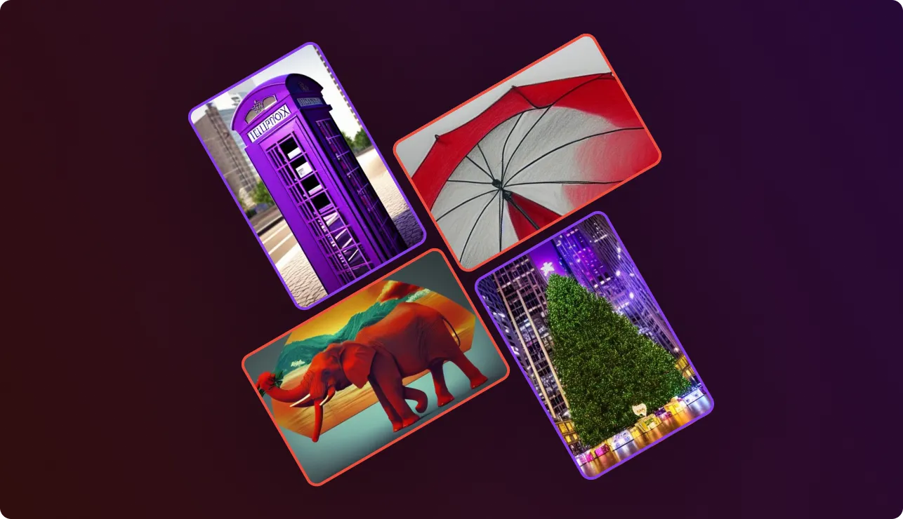
Adding colour influence with Avolo’s AI is easy; be it a photo of a purple Christmas tree or a blue London telephone box. If you can imagine it, you can create it. Learning how to make the best of AI takes a little bit of getting used to, but we’re here to help. In previous tutorials [make last two words a link] we’ve discussed how following the Idea → Subject → Frame prompt writing process helps you create breathtaking results, and in this tutorial we’ll discuss how to “hack” colour.
Colour is a powerful tool to add context to an image, or make us think “ooh, that’s unusual”. Let’s work with some such images.
First we’ll come up with some ideas for what we’d like to render. Since we’re doing colour today, I’ll be working with scenes that have distinctive recognisable high-colour subjects, or subjects for which colour influence our perception. British Telephone Boxes, Christmas Trees and Daffodils seem a good place to start.
Let’s get started with a few generic renders. We’ll use a relatively low level of detail to speed things along:
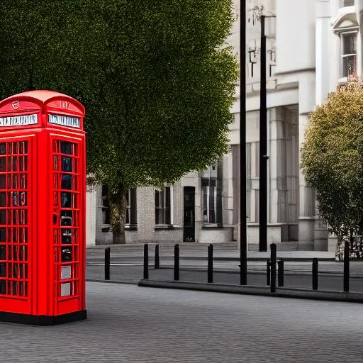
"A quiet London Street with a red BT phone box"
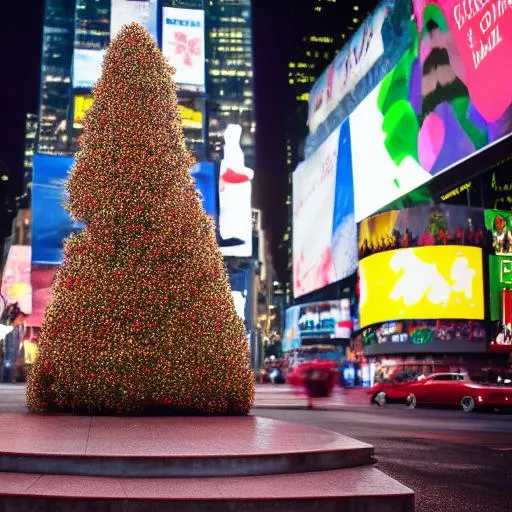
"Christmas tree outdoors in Times Square"
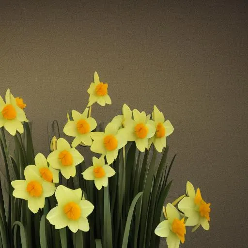
"Daffodils"
You’ll notice that we already added the keyword Red to the telephone box - this descriptive keyword helped the AI identify the style of the box as much as the colour - and highlights how colour can be used to describe something other than colour itself.
While it may seem obvious that I can define colour in my prompt (for example “Blue Daffodils”), there’s a second way. Each method has separate effect, and can be applied on its own or with the other, each time for differing effect.
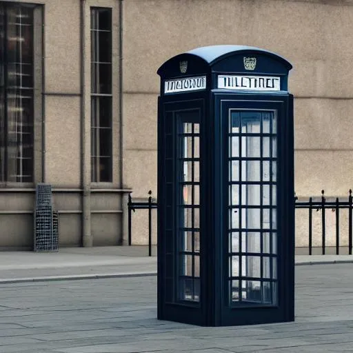
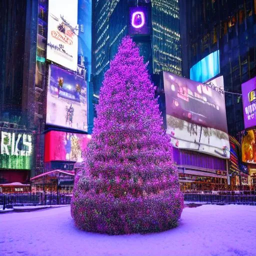
Imagine that what we really want is a blue telephone box in London (in the style of a London phone box), a purple Christmas tree, and blue daffodils. This could each be achieved with simple prompt adjustments:
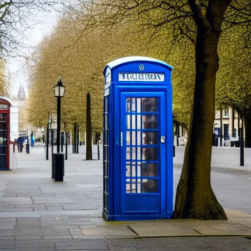
"A quiet London street with a BLUE BT phone box"
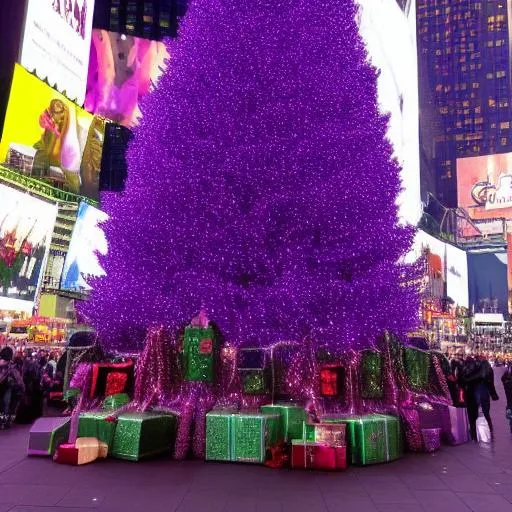
"Purple Christmas tree outdoors in Times Square"
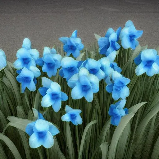
"Blue daffodils"
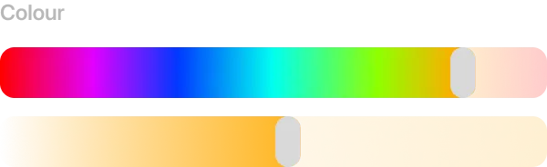
If I’m less interested in specific subjects, and more the general theme of an image, I can use the configuration options in Avolo's sidebar to apply colour themes on a contextual basis for images. Often, this alters the setting of a subject instead of the subject itself.
For example:
"A quiet London street with a BT phone box"
"Christmas tree outdoors in Times Square"
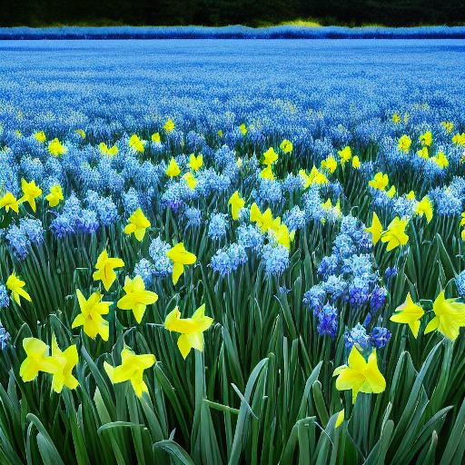
"Daffodils in field of blue flowers"
For best results, generally apply colour to subjects in prompts, and apply thematic colour using the colour influence slider in the sidebar.
Scenery views often do not contain a single subject, and so thematic colour is often more appropriate. Colour influence can be used to subtely indicate time of day, weather, or mood. For example, using the same prompt, and just by changing colour influence, we can render the Matterhorn at sunrise, sunset, and twilight:
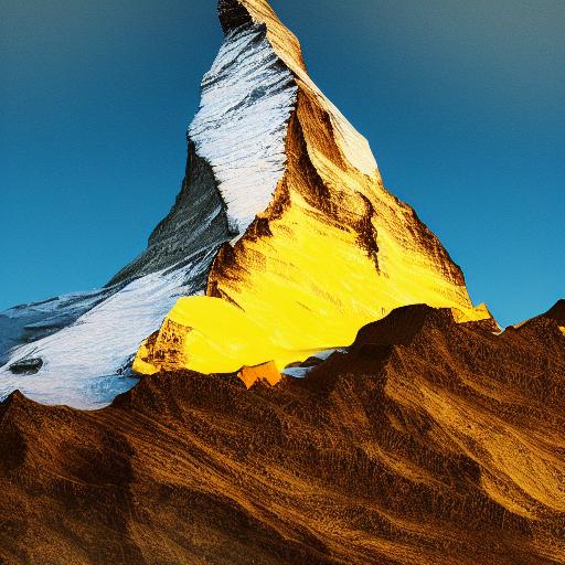
"Matterhorn"
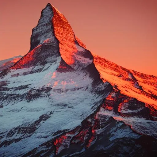
"Matterhorn"
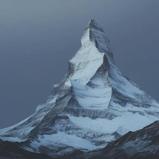
"Matterhorn"
Have fun - colour influence through Avolo is powerful - I can’t wait to see what you create.
Copyright ©2022 Avolo. All rights reserved. Powered by the team at Ephyna.
